Tasmania Prison Service website upgrade
In 2021 the Tasmania Prison Service website was rebuilt using the new standard Department of Justice web template. As part of this process the information architecture and content were completely reviewed. My role was to liaise with the content owners whilst they undertook the review, to assist by creating brand new pages and authoring some content (most notably the pages for each prison), and to ensure that all editors received the required training. I also selected the banner image and made some visual adjustments to the applied template. The upgraded site was launched in September 2021.
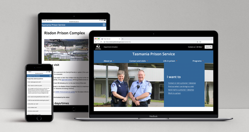
https://www.justice.tas.gov.au/prisonservice
Technologies used
HTML5, CSS, Squiz Matrix CMS, Jira, Confluence.
Planning in Tasmania website upgrade
In 2021 the Tasmanian Planning Reform unit website (rebranded to Planning in Tasmania) was updated to try and reduce the number of users contacting them with queries actually intended for the Tasmanian Planning Commission. The information architecture was reviewed and a new colour scheme was adopted to help delineate the unit's two main functions. The home page copy was also significantly reduced. My role was to provide guidance regarding the visual changes and information architecture, along with technical assistance in building and publishing the new structure in Squiz Matrix. The upgraded site was launched in October 2021.
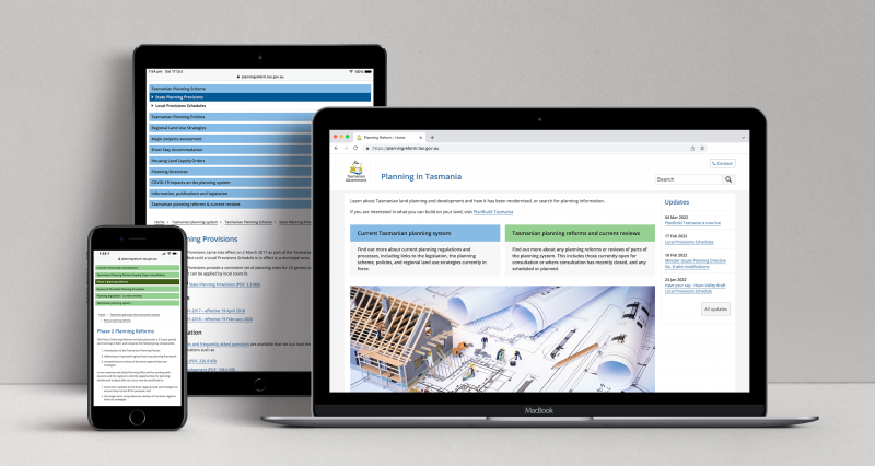
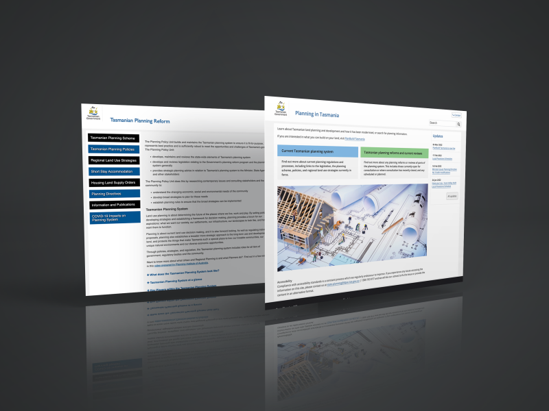
https://planningreform.tas.gov.au/
Technologies used
HTML5, CSS, Squiz Matrix CMS, Jira, Confluence, Gravit Designer Pro.
Template refresh for older Department of Justice websites
The Department of Justice maintains a large number of websites. During my employment there I was asked to take a look at fixing some of the accessibility errors coming up on the older websites (which were still using templates dating back to 2004). These errors included such things as poor text contrast and pages starting at h4 instead of h1, not to mention broken links, blank pages and inconsistent menu structures.
Ignoring sites that were in the process of being reviewed, I ended up with six that needed attention. Many of the issues were template-based, so rather than going through each one I suggested it might be worth building a completely new template that could be applied to all of the sites. This way they could also be visually refreshed a little, written in HTML5 and CSS3, and made responsive where they hadn't already been. It would also be much easier to maintain.
In Squiz Matrix it's possible to apply 'customisations' to each design template. In this instance it meant there could be a 'global' CSS file attached with all of the default styles, and then a separate CSS file for each site that dictated its unique colour scheme. Custom content areas allowed for the differences in each header and footer.
Apart from fixing the errors I increased the font sizes and line spacing across the board, used a more contemporary web font, replaced banner images with actual text where applicable, and eliminated the need for arrow gifs in the left navigation by using psuedo elements (which also meant their colour could be controlled via a site's custom CSS).
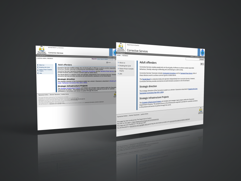
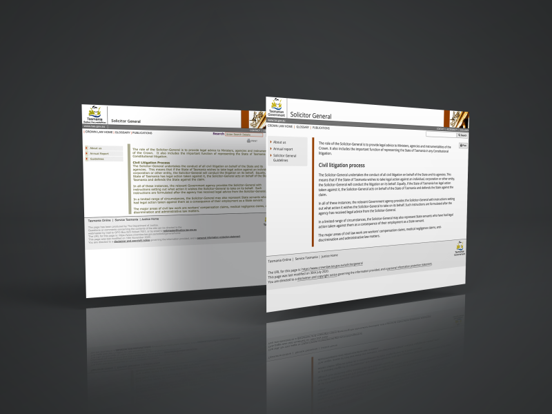
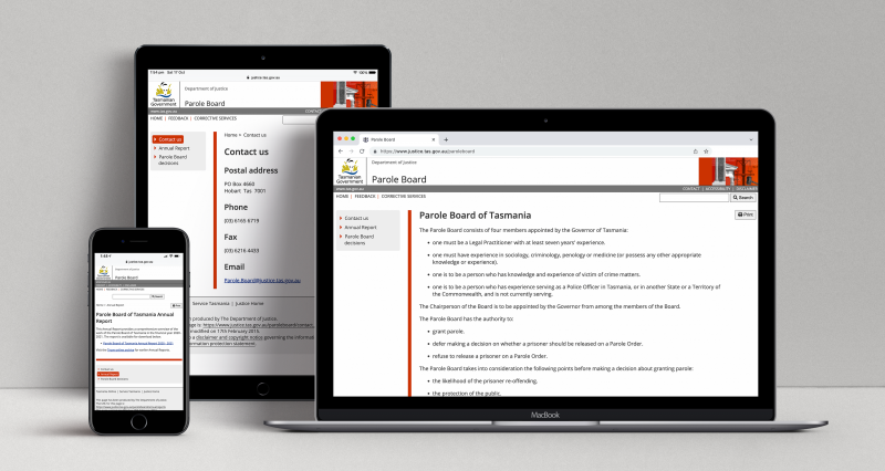
The content owners were all very happy with the refreshed appearance of their websites. The sites were upgraded to the new template over the course of two weeks in October 2021. Ultimately the template was also used for the old tribunal websites as part of the TASCAT project (see below).
https://www.crownlaw.tas.gov.au/
https://www.crownlaw.tas.gov.au/solicitorgeneral
https://www.crownlaw.tas.gov.au/crownsolicitor
https://www.justice.tas.gov.au/correctiveservices
https://www.justice.tas.gov.au/communitycorrections
https://www.justice.tas.gov.au/paroleboard
Technologies used
HTML5, CSS, Squiz Matrix CMS, Jira, Confluence.
TASCAT interim website
In late 2021, nine different tribunals were brought together to form the Tasmanian Civil and Administration Tribunal (TASCAT). With recognition that a full new website would be a significant undertaking, it was decided that an interim website would be built in time for the commencement of TASCAT. The interim website contains some new content, but primarily links off to the original tribunal websites (which were reviewed and rebranded). My role was to work with the Principal Registrar of TASCAT to establish the information architecture and textual content of the interim website, as well as providing advice on the structure of the original tribunal websites. I also made some visual adjustments to the template. The new site was launched in November 2021.
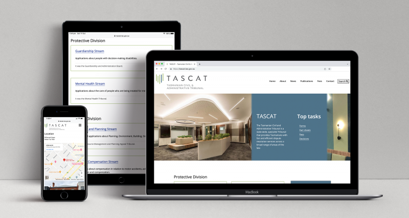
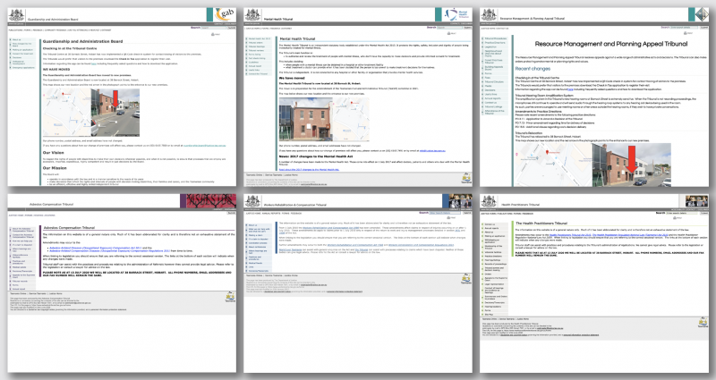
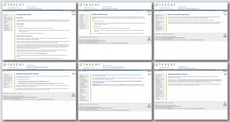
During the process of building the interim websites, I was also working on the abovementioned refreshed and responsive template for older Department of Justice websites. I made the suggestion that we could improve the original tribunal websites (to be known as 'streams' going forward) by applying this new template, adjusted to use the TASCAT branding. This gave them a fresh and cohesive new look without a lot of extra work.
Technologies used
HTML5, CSS, Squiz Matrix CMS, Jira, Confluence, Moqups, Gravit Designer Pro.

